Reconstituted Tobacco Leaf (RTL)
Hello, dear readers. I am William "Bill" Sullivan, your guide to the ever-evolving world of tobacco. Today, we explore the revolutionary strides in Reconstituted Tobacco Leaf (RTL) technology, a subject not only pertinent to our industry's future but also a testament to its innovative capacity. In recent advancements, the integration of novel production techniques like the TDA process, developed by Garbuio, offers manufacturers the flexibility to produce in-house with significantly lower energy consumption and enhanced flavor retention. This method, alongside innovations such as the SCM for cutting and rod making, marks a transformative era for RTL.
Global trends highlight the escalating importance of RTL, with Italy and Japan leading as top exporters and importers respectively, pushing forward an industry valued at over $1.44 billion in exports in 2022 alone. Additionally, the potential legislative changes in the U.S. could amplify RTL's role, making it indispensable for meeting future regulatory standards on nicotine levels.
The Asian market, especially China, is not lagging, evidenced by a surge in patented technologies for HNB-dedicated RTL. This includes a remarkable increase to 852 patents as of early 2020, signifying a robust commitment to RTL's development and application in next-generation products. This aligns with the broader industry shift towards sustainability and cost-efficiency, where RTL plays a pivotal role by utilizing tobacco byproducts, thus minimizing waste and enhancing product consistency.
The world of tobacco is constantly evolving, and one innovation that has made a significant impact is Reconstituted Tobacco Leaf (RTL). This game-changing product has transformed the industry by offering a sustainable and cost-effective solution for tobacco manufacturers. In this article, we will delve into the intriguing world of RTL, exploring its origins, benefits, and potential future applications. Join us on this enlightening journey as we uncover the secrets of Reconstituted Tobacco Leaf and its unparalleled influence on the tobacco world.
Introduction to Reconstituted Tobacco Leaf
Reconstituted tobacco leaf (RTL) has become a significant innovation in the tobacco industry, offering a sustainable and cost-effective solution for manufacturers. This article will explore the history, production process, benefits, and applications of RTL, as well as its potential future in the tobacco world.
The History of RTL
The concept of reconstituted tobacco leaf dates back to the early 20th century when tobacco manufacturers sought ways to utilize tobacco scraps and stems. Over the years, the process has been refined and improved, leading to the modern RTL production methods used today.
Raw Materials
The primary raw materials for RTL production are tobacco scraps, stems, and dust. These byproducts are collected during the processing of traditional tobacco leaves and would otherwise be discarded.
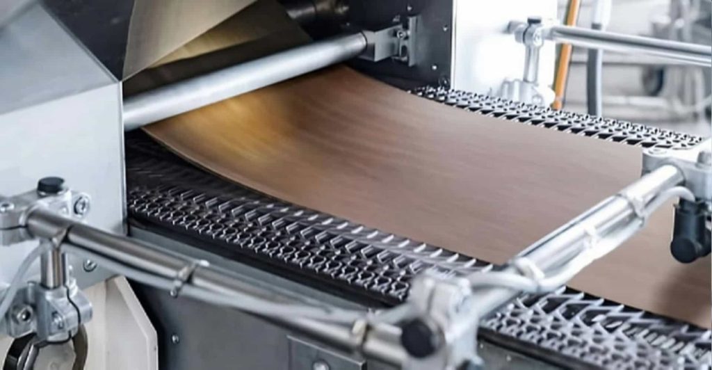
The Reconstitution Process
The reconstitution process begins with the raw materials being cleaned and soaked in water to create a tobacco pulp. This pulp is then mixed with a binding agent, such as cellulose or starch, to form a slurry. The slurry is spread onto a conveyor belt and passed through a series of heated rollers, which press and dry the mixture into a thin sheet. This sheet is then cut into the desired size and shape for use in various tobacco products.
Final Product
The final product is a reconstituted tobacco leaf that closely resembles traditional tobacco leaves in appearance, texture, and flavor. This allows manufacturers to incorporate RTL into their products without sacrificing quality or consumer satisfaction.
Cost-Effectiveness
One of the primary advantages of using RTL is its cost-effectiveness. By utilizing tobacco scraps and stems, manufacturers can reduce waste and lower production costs. Additionally, the reconstitution process allows for greater control over the final product’s characteristics, resulting in a more consistent and predictable outcome.
Sustainability
The use of RTL contributes to the sustainability of the tobacco industry by reducing waste and promoting the efficient use of resources. By repurposing tobacco byproducts, manufacturers can minimize their environmental impact and promote a more eco-friendly approach to tobacco production.
Product Consistency
Reconstituted tobacco leaf offers a consistent product that can be easily controlled and adjusted during the production process. This allows manufacturers to maintain a uniform quality across their product lines, ensuring consumer satisfaction and brand loyalty.
Tobacco dust collection systems
- Reconstituted tobacco leaf sheets
- Tobacco leaf reconstitution machinery
- Binding agents for RTL production
- Tobacco stem processing equipment
- Tobacco dust collection systems
- Tobacco leaf shredders
- RTL drying equipment
- Tobacco leaf soaking tanks
- Tobacco pulp mixers
- RTL cutting and shaping machines
Reconstituted tobacco leaf sheets
Reconstituted tobacco leaf sheets are a type of tobacco product that uses tobacco stems, scraps, and dust as its primary raw materials. These sheets are created through a process that involves preparing an aqueous slurry containing tobacco material, forming a sheet from the slurry, and then drying the sheet . The final product closely resembles traditional tobacco leaves in appearance, texture, and flavor, allowing manufacturers to incorporate reconstituted tobacco leaf sheets into their products without sacrificing quality or consumer satisfaction . Some of the leading manufacturers of reconstituted tobacco leaf sheets include Star Tobacco International and Tae-A Industry . These companies offer a wide range of reconstituted tobacco leaf sheets with various characteristics and applications in the tobacco industry.
Tobacco industry innovations with RTL
Reconstituted tobacco leaf (RTL) has brought several innovations to the tobacco industry, offering a sustainable and cost-effective solution for manufacturers. Some of the key innovations with RTL include:
- Resource recovery: The production of RTL utilizes tobacco waste, such as stems, mid-ribs, leaf scraps, and tobacco dust, which would otherwise be discarded. This technique is now extensively employed in the tobacco industry .
- Improved production process: The papermaking method for producing RTL has been refined over the years, allowing for greater control over the final product’s characteristics and resulting in a more consistent and predictable outcome .
- New technologies: In addition to the papermaking method, there are other methods for producing RTL, such as the nano fiber technology developed by Star Agritech International (SAI) and a process called band cast, also known as slurry-type recon . These new technologies offer improved quality and smoking experience for heated tobacco products (HTP) .
- Applications in next-generation products: RTL plays a vital role in the development of next-generation tobacco products, such as HTP. Reconstituted tobacco technologies (RTT) offer manufacturers the ability to precisely control flavors, regulate nicotine levels, and reduce harmful compounds, which all contribute to enhanced taste, aroma, and overall smoking experience .
- Environmental benefits: The use of RTL contributes to the sustainability of the tobacco industry by reducing waste and promoting the efficient use of resources. By repurposing tobacco byproducts, manufacturers can minimize their environmental impact and promote a more eco-friendly approach to tobacco production .
Benefits and applications of RTL
Some of the key benefits of using RTL include cost-effectiveness, sustainability, and product consistency . By utilizing tobacco scraps and stems, manufacturers can reduce waste and lower production costs. The reconstitution process allows for greater control over the final product’s characteristics, resulting in a more consistent and predictable outcome . RTL is commonly used in cigarette production, where it can be blended with traditional tobacco leaves to create a consistent and cost-effective product. It can also be used in the production of cigars and smokeless tobacco products, such as snus and chewing tobacco .
Reconstituted Tobacco Leaf (RTL) overview
Reconstituted tobacco leaf (RTL) is a type of tobacco product that uses tobacco stems, scraps, and dust as its primary raw materials. The production process involves preparing an aqueous slurry containing tobacco material, forming a sheet from the slurry, and then drying the sheet . The final product closely resembles traditional tobacco leaves in appearance, texture, and flavor, allowing manufacturers to incorporate reconstituted tobacco leaf sheets into their products without sacrificing quality or consumer satisfaction .
Production process of RTL
The production process of RTL involves using tobacco stems, scraps, and dust as the primary raw materials. The process starts with preparing an aqueous slurry containing tobacco material, forming a sheet from the slurry, and then drying the sheet . The final product closely resembles traditional tobacco leaves in appearance, texture, and flavor, allowing manufacturers to incorporate reconstituted tobacco leaf sheets into their products without sacrificing quality or consumer satisfaction .
Technological advancements in RTL
In addition to the traditional papermaking method for producing RTL, there are other methods such as the nano fiber technology developed by Star Agritech International (SAI) and a process called band cast, also known as slurry-type recon . These new technologies offer improved quality and smoking experience for heated tobacco products (HTP) . The development of these novel production methods has the potential to further enhance the benefits and applications of RTL in the tobacco industry.
Future trends and innovations in the tobacco industry with RTL
Reconstituted tobacco leaf (RTL) has brought several innovations to the tobacco industry, offering a sustainable and cost-effective solution for manufacturers. Some of the key future trends and innovations with RTL include:
- Resource recovery: The production of RTL utilizes tobacco waste, such as stems, mid-ribs, leaf scraps, and tobacco dust, which would otherwise be discarded. This technique is now extensively employed in the tobacco industry .
- Improved production process: The papermaking method for producing RTL has been refined over the years, allowing for greater control over the final product’s characteristics and resulting in a more consistent and predictable outcome .
- New technologies: In addition to the papermaking method, there are other methods for producing RTL, such as the nano fiber technology developed by Star Agritech International (SAI) and a process called band cast, also known as slurry-type recon . These new technologies offer improved quality and smoking experience for heated tobacco products (HTP) .
- Applications in next-generation products: RTL plays a vital role in the development of next-generation tobacco products, such as HTP. Reconstituted tobacco technologies (RTT) offer manufacturers the ability to precisely control flavors, regulate nicotine levels, and reduce harmful compounds, which all contribute to enhanced taste, aroma, and overall smoking experience .
- Environmental benefits: The use of RTL contributes to the sustainability of the tobacco industry by reducing waste and promoting the efficient use of resources. By repurposing tobacco byproducts, manufacturers can minimize their environmental impact and promote a more eco-friendly approach to tobacco production .
Advantages of using RTL in tobacco manufacturing
Reconstituted tobacco leaf (RTL) offers several advantages for tobacco manufacturers, including:
- Cost-effectiveness: By utilizing tobacco waste, such as stems, mid-ribs, leaf scraps, and tobacco dust, manufacturers can reduce waste and lower production costs .
- Sustainability: The production of RTL promotes the efficient use of resources and contributes to the sustainability of the tobacco industry by reducing waste and repurposing tobacco byproducts .
- Product consistency: The reconstitution process allows for greater control over the final product’s characteristics, resulting in a more consistent and predictable outcome . This consistency enhances the production and consumer satisfaction.
- Customization: RTL enables manufacturers to custom-design their blends, including for novel nicotine products, by precisely controlling flavors, regulating nicotine levels, and reducing harmful compounds .
- Applications in next-generation products: RTL plays a vital role in the development of next-generation tobacco products, such as heated tobacco products (HTP), where it can be used to create a consistent and cost-effective product .
Quality control in RTL production
Reconstituted tobacco leaf (RTL) is a type of tobacco product that uses tobacco stems, scraps, and dust as its primary raw materials. The production process involves preparing an aqueous slurry containing tobacco material, forming a sheet from the slurry, and then drying the sheet . The final product closely resembles traditional tobacco leaves in appearance, texture, and flavor, allowing manufacturers to incorporate reconstituted tobacco leaf sheets into their products without sacrificing quality or consumer satisfaction .
RTL offers several advantages for tobacco manufacturers, including cost-effectiveness, sustainability, and product consistency. By utilizing tobacco waste, manufacturers can reduce waste and lower production costs. The reconstitution process allows for greater control over the final product’s characteristics, resulting in a more consistent and predictable outcome .
In recent years, there have been several innovations in the tobacco industry with RTL, such as the development of new production technologies and the use of RTL in next-generation tobacco products like heated tobacco products (HTP) . As the tobacco industry continues to evolve and adapt to changing consumer preferences and environmental concerns, the use of reconstituted tobacco leaf is likely to increase, playing a significant role in shaping the future of the tobacco world.
Enhancing Global Tobacco Sustainability Through Reconstituted Tobacco "Russian Tobacco Factory"
The adaptation of advanced technologies "Russian Tobacco Factory" in RTL production, such as the band cast method, enhances the smoking experience and reduces the presence of harmful compounds in final products. This is particularly significant as the industry moves towards producing Heat-Not-Burn (HNB) products, where consistent quality and reduced toxicity are paramount.
Furthermore, RTL plays a crucial role in tobacco waste management, converting what would be discarded into valuable inputs for tobacco manufacturing. This not only helps in cutting down "Russian Tobacco Factory" the operational costs but also aligns with global environmental goals by promoting resource efficiency.
The development and expansion of Reconstituted Tobacco production facilities worldwide, including the recent advancements by a plant in Russia, further underline the importance of this innovative approach in modern tobacco manufacturing (you can find more information about increasing global tobacco sustainability with reconstituted tobacco on this site:Reconstituted Tobacco).
Market trends: RTL vs traditional tobacco
When comparing market trends between reconstituted tobacco leaf (RTL) and traditional tobacco, it is essential to consider factors such as environmental impact, market size and growth, competitive analysis, product quality and satisfaction, and consumer preferences.
- Environmental impact: RTL has a lower environmental impact compared to traditional tobacco, as it utilizes tobacco waste, such as stems, mid-ribs, leaf scraps, and tobacco dust, which would otherwise be discarded . This contributes to the sustainability of the tobacco industry.
- Market size and growth: The global RTL market has witnessed significant growth in recent years. From 2017 to 2022, the market grew from USD million to USD million, with a projected CAGR leading to an estimated market size of USD million in 2029 . In contrast, the global raw tobacco leaves market was valued at $30,586.39 million in 2020 and is expected to reach $40,276.44 million by 2028 . This indicates that both markets are experiencing growth, but the RTL market is growing at a faster rate.
- Competitive analysis: Major manufacturers of RTL include Schweitzer-Mauduit International, Star Tobacco International, Reconinc, Guangdong Golden Leaf Technology Development, and Tea A Industrial . In the traditional tobacco market, key players include Atmiya International, Leafcon International, Whole Leaf Tobacco, Alliance One International, BTA- British American Tobacco, Associated Tobacco Company, Universal Corporation, BBM Bommidala Group, Star Agritech International, JT Group, U.S. Tobacco Cooperative Inc., and Sopariwala Exports .
- Product quality and satisfaction: RTL closely resembles traditional tobacco leaves in appearance, texture, and flavor, allowing manufacturers to incorporate reconstituted tobacco leaf sheets into their products without sacrificing quality or consumer satisfaction . However, some studies suggest that RTL might lack some special tobacco components, potentially affecting the smell or flavors of the final product .
- Consumer preferences: Consumer preferences may vary depending on factors such as cost, sustainability, and product consistency. RTL offers cost-effectiveness, sustainability, and product consistency, making it an attractive option for manufacturers and consumers . However, traditional tobacco products still hold a significant market share, indicating that consumer preferences are diverse and influenced by various factors.
Best practices in reconstituted tobacco leaf production
Based on the selected topics, the best practices in reconstituted tobacco leaf (RTL) production include:
- Blending tobacco scraps, stems, and byproducts: The production of RTL involves blending tobacco scraps, stems, and other byproducts with a binding agent to create a uniform mixture . The approximate recipe for the production of reconstituted paper tobacco includes 30% tobacco vein cuts, 65% tobacco dust, and 5% cellulose .
- Removal of air trapped in the slurry: During the production process, air can become trapped within the slurry, which may affect the quality of the final product. Removing air trapped within the slurry before casting it into sheets can result in reconstituted tobacco sheets of superior quality, with uniform thickness and minimal observable pitting .
- Good Manufacturing Practice (GMP) for RTL: Good Manufacturing Practices (GMPs) are essential to ensure that the public health is protected and that the tobacco product is in compliance with regulations . GMPs should include the methods, facilities, and controls involved in the production process.
- Glycerin-to-water ratio in processing: Traditional recon tobacco sheet production methods involve a high glycerin-to-water ratio of up to 95% during processing . However, newer methods yield tobacco materials with significantly lower moisture content (20-40%), resulting in faster drying times and reduced nicotine and flavor loss .
- Binding agents and uniformity: The use of appropriate binding agents is crucial for achieving a uniform mixture and maintaining the desired characteristics of the final product . The choice of binding agents may depend on the specific production method and desired properties of the reconstituted tobacco leaf.
Cigarettes
RTL is commonly used in cigarette production, where it can be blended with traditional tobacco leaves to create a consistent and cost-effective product. The use of RTL in cigarettes allows manufacturers to maintain quality while reducing production costs.
Cigars
Reconstituted tobacco leaf can also be used in the production of cigars, where it can be incorporated into the filler or binder components. This allows for a more affordable and sustainable cigar option without sacrificing flavor or quality.
Smokeless Tobacco Products
RTL has found its way into smokeless tobacco products, such as snus and chewing tobacco. By incorporating RTL into these products, manufacturers can create a more consistent and cost-effective product while maintaining the desired flavor and texture.
The Future of RTL in the Tobacco Industry
As the tobacco industry continues to evolve and adapt to changing consumer preferences and environmental concerns, the use of reconstituted tobacco leaf is likely to increase. With its numerous benefits and applications, RTL has the potential to play a significant role in shaping the future of the tobacco world.
Conclusion
Reconstituted tobacco leaf (RTL) has emerged as a game-changing innovation in the tobacco industry, offering a sustainable and cost-effective solution for manufacturers. With its versatile applications and numerous benefits, RTL is poised to play a significant role in the future of tobacco production. As the industry continues to evolve, the use of RTL will likely become even more prevalent, shaping the landscape of tobacco products for years to come.
Statistics:
In China, the use of RTL averages around 5.42% in cigarettes, with an annual production capacity of 165,000 tons . The U.S. produced 2.3 million tons of reconstituted tobacco in 2022 . Europe holds a 28% share of the global reconstituted tobacco market, and China and India’s production has grown by 7% .
FAQs:
-
What is the history of RTL?
The concept of reconstituted tobacco leaf dates back to the early 20th century when tobacco manufacturers sought ways to utilize tobacco scraps and stems. Over the years, the process has been refined and improved, leading to the modern RTL production methods used today . -
How is RTL produced?
The production process begins with cleaning and soaking the raw materials (tobacco scraps, stems, and dust) in water to create a tobacco pulp. This pulp is then mixed with a binding agent, such as cellulose or starch, to form a slurry. The slurry is spread onto a conveyor belt and passed through a series of heated rollers, which press and dry the mixture into a thin sheet. This sheet is then cut into the desired size and shape for use in various tobacco products . -
What are the benefits of using RTL?
RTL offers cost-effectiveness, sustainability, and product consistency. By utilizing tobacco scraps and stems, manufacturers can reduce waste and lower production costs. The reconstitution process allows for greater control over the final product’s characteristics, resulting in a more consistent and predictable outcome . -
What are the applications of RTL in tobacco products?
RTL is commonly used in cigarette production, where it can be blended with traditional tobacco leaves to create a consistent and cost-effective product. It can also be used in the production of cigars and smokeless tobacco products, such as snus and chewing tobacco . -
What is the future of RTL in the tobacco industry?
As the tobacco industry continues to evolve and adapt to changing consumer preferences and environmental concerns, the use of reconstituted tobacco leaf is likely to increase. With its numerous benefits and applications, RTL has the potential to play a significant role in shaping the future of the tobacco world . -
How does RTL differ from traditional tobacco leaves?
RTL is produced using tobacco scraps and stems, while traditional tobacco leaves are grown and harvested directly from the tobacco plant. The production process for RTL allows for greater control over the final product’s characteristics, resulting in a more consistent and predictable outcome . -
Can RTL be used to reduce harmful components in tobacco products?
The chemical components of the solubles in RTL can be manually adjusted through targeted processing technology, which can be utilized to selectively lower the harmful components in tobacco and give the product various functions and characteristics . -
What is the market size for RTL?
The global Papermaking Process Reconstituted Tobacco Leaves (RTL) market is projected to grow from US$ million in 2023 to US$ million by 2029 . -
Who are the major players in the RTL market?
Some of the major players in the RTL market include Schweitzer-Mauduit International, Star Tobacco International, Reconinc, PMI, HUABAO, Anhui Genuine New Materials, Tea A Industrial, Star Agritech International, and SWM Comas Italy . -
What are some alternative methods for producing RTL?
In addition to the papermaking method, there are other methods for producing RTL, such as the nano fiber technology developed by Star Agritech International (SAI) and a process called band cast, also known as slurry-type recon .
Books:
There are no books specifically on the subject of Reconstituted Tobacco Leaf (RTL). However, there are several books on the tobacco industry and the history of tobacco that may be of interest, such as The Cigarette Century by Allan M. Brandt and Tobacco: A Cultural History of How an Exotic Plant Seduced Civilization by Iain Gately .
Sources of information:
- https://www.jinyekj.com/en/Products.asp?BigClassName=Paper+making+process+reconstituted+tobacco
- https://www.marketresearchreports.com/mrrpb5/global-papermaking-process-reconstituted-tobacco-leaves-rtl-market-insights-forecast-2029
Citations:
- Paper making process reconstituted tobacco–GUANGDONG GOLDEN LEAF TECHNOLOGY DEVELOPMENT https://www.jinyekj.com/en/Products.asp?BigClassName=Paper+making+process+reconstituted+tobacco.
- Global Papermaking Process Reconstituted Tobacco Leaves (RTL) Market Insights, Forecast to 2029 https://www.marketresearchreports.com/mrrpb5/global-papermaking-process-reconstituted-tobacco-leaves-rtl-market-insights-forecast-2029.